|
|
#1 |
|
Участник
|
atinkerersnotebook: Using PowerPivot to Analyze Dynamics AX Data
Источник: http://atinkerersnotebook.com/2013/1...amics-ax-data/
============== Perhaps you have heard about the new tool in Excel 2010, PowerPivot, but wonder how it can enhance your use of Excel. In this session, geared towards beginner PowerPivot users and those wanting to learn more about the features of PowerPivot, learn how PowerPivot can assist you with advanced data analysis and reporting, making those extracts from Dynamics AX to Excel even more valuable. Using Pivot Tables to Analyze Dynamics AX Data At one point or another, everyone has probably used Pivot tables within Excel to slice and dice information. PowerPivot is an extension of this functionality, so it makes sense to initially show how this works before showing all of the new features that are available within PowerPivot. How to do it… To use PivotTables to analyze information from within Dynamics AX, follow these steps:
All you have to do to create a report through the Pivot Table is drag and drop the fields into the designer panel.  If you click on the Pivot Chart button within the Insert ribbon bar, you will be able to add a Pivot Chart that is based on the data that you have reported off.  You can select the style of chart that you want to add to the worksheet from the Chart Gallery, and click the OK button to add it to the worksheet.  Any changes that you make to the data will be reflected in both the Pivot Table and Chart.  Using PowerPivot to create Dashboards PowerPivot gives you all of the capabilities that the Pivot Tables have, plus more. With PowerPivot you can create pivot tables and charts, and also dashboards with multiple panels showing that use the same data source. How to do it… To access the data tables through the PowerPivot Manager and also create more elaborate dashboards, follow these steps:
You can then build the reports individually.  Repeating the process for the other panels will give you a multipanel dashboard for reporting off your data.  Adding Timeline Slicers to PowerPivot Dashboards PowerPivot has a couple of extra features that you can take advantage of while you are building your dashboards for slicing and filtering your data. One is called a Timeline Slicer. How to do it… To add a Timeline Slicer to your PowerPivot Dashboard, follow these steps:
Now you can filter the data that is displayed by date range with the slicer.  Creating Additional Calculated Columns Where PowerPivot starts to really outshine the simple Pivot Tables is in the feature that allows you to create new columns through the PowerPivot Manager. You can then filter, and report off the results as if it were a normal field in the system. How to do it… To quickly create calculated columns through PowerPivot, follow these steps:
The difference is that you only need to do it once and then all of the records will be updated.  Applying Filters to your Data Model Within the PowerPivot Data Model editor, you can also filter the data that is returned to Excel through the filtering option. How to do it… To can add a filter to a table in your data model, follow these steps:
After applying the filter you will only see the data that matches.  Creating Joins between Multiple Datasets PowerPivot has another great feature that allows you to create relationships between tables so that you can report off both tables within the same query. Getting Ready… For this example we will add a new set of data to the Excel spreadsheet through the Dynamics AX Excel add-in. To do this, follow these steps:
To link multiple tables through the table designer tool, follow these steps:
To create a report off this linked data, click on the PivotTable button and select the PivotTable option.  This will return you to Excel, and you can specify where you want to show the Pivot Table – select the defaults to create a new worksheet and click the OK button.  Now you will see both tables within the field explorer on the right.  You can select fields from either table.  The data will then be linked based on your relationship that you have defined within the table designer.  Using Functions to create Calculated Columns Just as you can do within Excel, you can also use any of the built in functions within the Data Model designer. This allows you to perform string and date manipulation as you create new column definitions, giving you more reporting options than are available within the default tables. How to do it… To use functions within calculated columns, follow these steps:
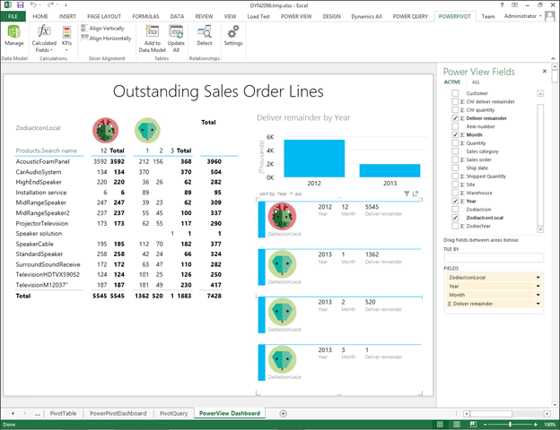
Now you will have a new column for the year.  You can rename the column and then repeat the process for the Month as well.  Rather than create a Pivot Table, this time we will return to Excel and create a PowerView dashboard by clicking on the PowerView button within the Reports group of the Insert ribbon bar.  This will open up a PowerView canvas and you will see all of the tables and fields on the right. Notice though that some of them have database symbol in the bottom right hand corner – that indicates that they are housed in the PowerPivot Model rather than within Excel.  Now all you need to do is drag and drop the fields into the query panels to create a new dashboard.  You can add as many different panels to the dashboard as you want.  Creating URL and Picture Columns There are a number of different types of columns types that you can define within the PowerPivot manager, which act differently based depending on where they are used. One example are the Image column types. If you have a column that links to an image file then you can use it within your dashboards to spice things up a little. Getting Ready… For this example we will convert the year into the corresponding symbol from the Chinese Zodiac. To do this I added all of the images into a shared library within SharePoint for reference.  You can now add a new column that calculates the sequence in the Zodiac that the year falls into.  To reference the image, you can look at the properties of the image so that you can get the template for the URL.  How to do it… To use PowerPivot to define image columns, follow these steps:
Now when you use the Image URL fields, the images will be rendered rather than the URL itself.  How cool is that. Creating a PowerPivot Gallery within SharePoint PowerPivot has a very cool feature that allows you to publish your data to PowerPivot Galleries within SharePoint. This allows users to access and report off the data that you build within Excel, but do it all through the Web. In order to enable this feature, you first need to create a PowerPivot Gallery in SharePoint. How to do it… To create a PowerPivot Gallery site within your existing SharePoint site, follow these steps:
When the new site is created, there will be a link in the navigation bar for the PowerPivot Gallery.  The PowerPivot Gallery is now ready to host your PowerPivot data sources.  Saving PowerPivot Data Models to the PowerPivot Gallery Once you have created your PowerPivot Gallery, you can publish the PowerPivots that you create within Excel there and host them within SharePoint. How to do it… To publish a PowerPivot Workbook to a PowerPivot Gallery, follow these steps:
When you return to the PowerPivot Gallery you will see a thumbnail view of the workbook.  Note: It may take a minute or so for it to render the thumbnail properly, so be patient. Creating PowerView Dashboards from the PowerPivot Gallery Data Sources The real benefit of hosting your PowerPivot workbooks within a PowerPivot Gallery is that people can then report off the data source as if it were a mini data warehouse using PowerView. How to do it… To create a PowerView dashboard from a PowerPivot data source, follow these steps:
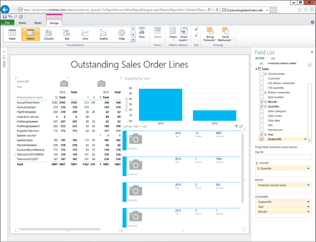
The gallery will be replaced with a PowerView Reporting Canvas with the fields from the PowerPivot being displayed as reporting fields.  You can build the PowerView dashboard through the web interface in just the same was as we built them from within Excel.  After you have created the dashboard, click on the File menu, and then select the Save As option to save your dashboard back to your PowerPivot Gallery.  All you need to do is save give your dashboard a name and click the Save button.  Now you will see the report that you generated within the PowerPivot Gallery alongside the PowerPivot Data Source.  Changing the View Mode for the PowerPivot Gallery If you want to show off, you can also change the style of the PowerView Gallery to Carrousel, Theatre, or List mode depending on where you are embedding the view. How to do it… To change the view style of the PowerPivot Gallery, follow these steps:
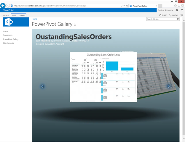
The Carousel view will allow you to browse through the different workbooks like a juke box.  The Theatre view will flatten the views out showing thumbnails in the footer and then larger views in the header.  The All Documents view will look more like a traditional windows file explorer view.  Setting PowerPivot Data Model Refresh Rates When the Power Pivot Data Models are stored within a PowerPivot Gallery, you will want to have them periodically refresh to get the latest information. Rather than doing this manually, you can configure a default refresh rate and the gallery will do the rest for you. How to do it… To enable automatic refreshing of the Power Pivot Data Models when they are stored within the PowerPivot Galleries, follow these steps:
Once a PowerView Dashboard is hosted within the PowerPivot Gallery, there is one cool feature that you can take advantage of which allows you to export any of the dashboards to PowerPoint and then have a live and interactive version of the dashboard as a PowerPoint slide. How to do it… To export PowerView Dashboards to PowerPoint, follow these steps:
Now when you open up the PowerPoint, you will see a slide that has a copy of the report embedded in it.  When you go into slideshow mode, you will notice a small Interact button in the bottom right of the form.  If you click on the button, the dashboard becomes interactive, receiving all of the data from the PowerPivot Data Source that you hosted on the PowerPivot Gallery.  That is too cool. Summary PowerPivot is a great that gives you a lot more capabilities that the normal Pivot function lacks, and in this worked example we have shown how it also extends out to SharePoint giving you a number of new publishing and visualization options. Once you have mastered all of the basics of PowerPivot, you may want to dive into some other features like:
 Источник: http://atinkerersnotebook.com/2013/1...amics-ax-data/
__________________
Расскажите о новых и интересных блогах по Microsoft Dynamics, напишите личное сообщение администратору. |
|
|
|
|
#2 |
|
Участник
|
dynamicscare: Using PowerPivot to Analyze Dynamics AX Data
Источник: http://dynamicscare.com/blog/using-p...amics-ax-data/
============== Perhaps you have heard about the new tool in Excel 2010, PowerPivot, but wonder how it can enhance your use of Excel. In this session, geared towards beginner PowerPivot users and those wanting to learn more about the features of PowerPivot, learn how PowerPivot can assist you with advanced data analysis and reporting, making those [...] Источник: http://dynamicscare.com/blog/using-p...amics-ax-data/
__________________
Расскажите о новых и интересных блогах по Microsoft Dynamics, напишите личное сообщение администратору. |
|
|
|
|
|