|
|
#1 |
|
Участник
|
crmtipoftheday: Tip #1168: Sitemap and Commanding changes on Unified Interface
Источник: https://crmtipoftheday.com/1168/site...ied-interface/
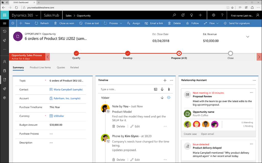
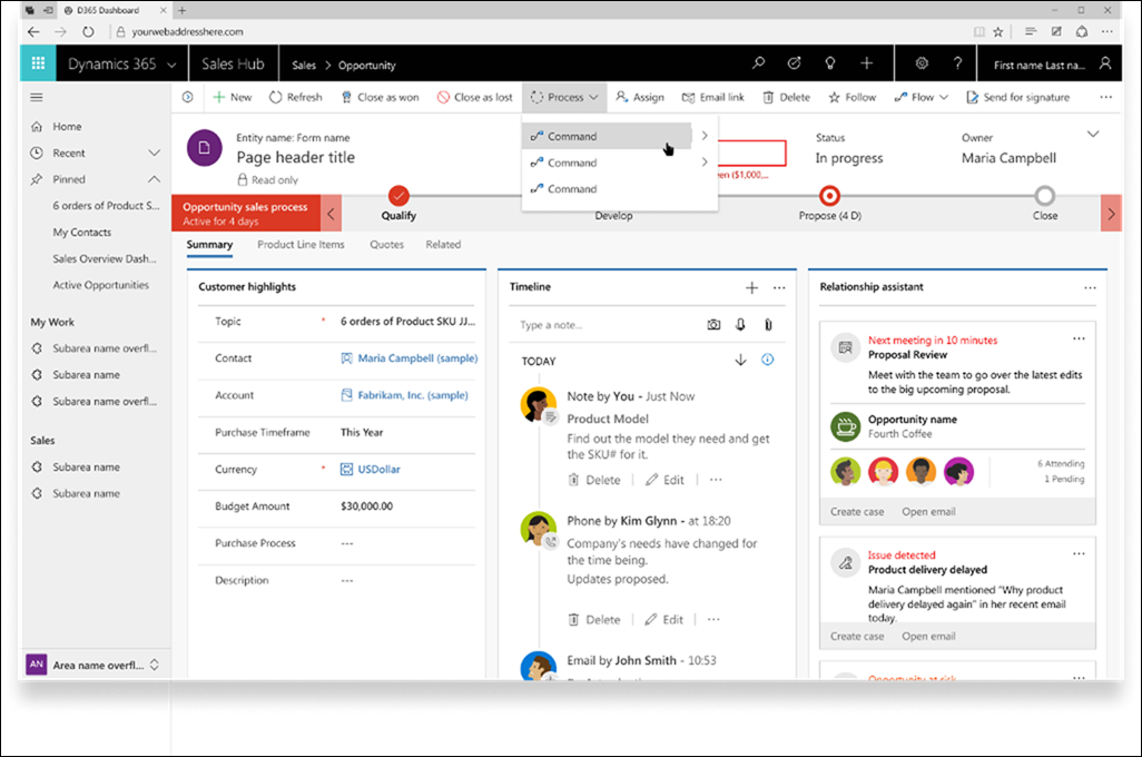
============== Developing user experience is a complex iterative process and it usually takes few iterations to get things right. Unified Interface is no exception. Some things are brilliant and some, uhm, require further work. The good news is that changes are coming. The “bad” news that they are coming very, very soon so it’d be a good idea to make sure that your users are ready. Details Shilpa Sinha, Principal PM at Microsoft, explains upcoming changes: We are making some significant investments to improve user experiences on Unified Interface, in our first phase, we are addressing our most complained about issue in UX: Difficulty in navigation. This is an accelerated effort, and we are aiming to land these changes as part of our October momentum. These changes are going to affect our existing customers on Unified Interface as it is a visual and navigation enhancement. This will not be an opt-in experience. Details with screen shots are below and I want your help to educate our customers about this change. These changes address the worst of our users’ pain points as reported in our surveys as well as user research studies. Before  After  Sitemap changes
These changes are aimed at improving user experience for desktop browser users at widths above 480px so single column layout, mail app and mobile are not affected. Tîpp Jäår $0.02 The other good news is that we seems to be getting back some beloved and sorely missed elements from the olden days of CRM 4 – left-hand navigation and colorful icons. (Facebook and Twitter cover photo by Kelly Sikkema on Unsplash) Источник: https://crmtipoftheday.com/1168/site...ied-interface/
__________________
Расскажите о новых и интересных блогах по Microsoft Dynamics, напишите личное сообщение администратору. |
|
|